


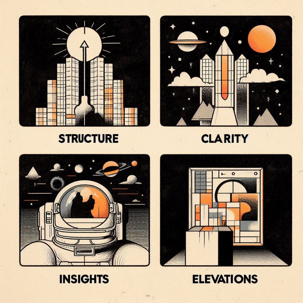
Four Principles: 1. Clarity
On Clarity, Structure, Insights & Elevations.

Six years ago, I wanted to find something universal to say on the subject of creative success. I put together four fundamental principles for making hit video formats, primarily on YouTube. I’ve since returned to them frequently and been struck by how universally applicable they are to creating resonant media of all kinds. As I’ve said many, many times - if you take care of these four things, you’re already well ahead of 95% of the competition. Assuming you care about that sort of thing.
The Four Principles
Clarity
Insights
Elevations
The short, trite and obvious advice I could give you is that to have your best chance of reaching people, you should make clear, well-structured, insightful and elevated stuff. As advice, it’s a step above “just make the best videos you can” or “great content finds its audience” but only just. That’s the “reading aloud the words on the slide” version. What I really want to encourage you to do is examine, understand and deepen your relationship with each of the principles, to notice how complex and elusive these four apparently simple aspects of art, entertainment and content can be.
The four principles match up neatly with The Attention Journey. Clarity in the hook. A way-in for the viewer through structure. Insights as primary appeal. Elevations as secondary appeal. But we can get to that in a later post.
On Clarity
“In a world deluged by irrelevant information, clarity is power.” - Yuval Noah Harari
The importance of making it clear why anyone should watch your film, show or video seems so obvious that it almost needn’t be remarked upon. It should, in most cases, be clear from the log-line, the thumbnail, the key art, the title, the description and/or the intro what it is and what it’s offering a potential viewer. Yet, so often, people fall at the first hurdle by underestimating the importance of streamlining, sharpening and distilling their message at the first point of contact.
It’s hard. Harder than you first might think. It’s also much maligned - there’s a widely-experienced sense that clearly articulating the appeal of something cheapens the work itself. If you actually want people to see the thing you’ve worked hard to make, you simply have to lower the barrier to entry as much as you reasonably can without affecting the meaning or integrity of the work. I’ve lost track of the number of brilliant short docs I’ve seen which, due to lack of clear communication of their value and appeal, are bursting with credibility and starving for views. It’s often the case that the artist that has sacrificed and been to a vulnerable place to create something may well not be the right person to choose a single image or write a 56 character summation in order to entice people.
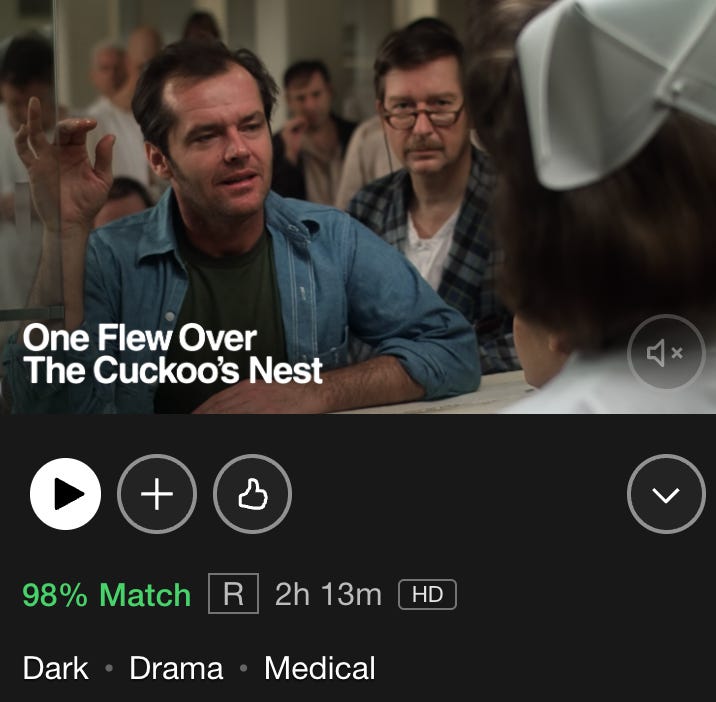
One of the things that makes it so difficult is the challenge of determining the core appeal or appeals of a creative work. There’s a flinty pragmatism to it and it requires a sometimes-brutal acuity of thought. Ask yourself tough questions and think hard about the answers.1 I’m a bit reluctant to even bring up the notion of appeal - though I’ve written about it previously - but simply, if you can’t determine the primary reasons people might watch something or you find that you can’t clearly communicate those reasons, it’s probably worth taking a minute and rethinking some things. It can be jarring, for example, how disconnected the text that accompanies movies can be on streaming services - the dispassionate plot descriptions or those strangely incongruous three words on Netflix.
Clarity of Language
“In anything at all, perfection is finally attained not when there is no longer anything to add, but when there is no longer anything to take away, when a body has been stripped down to its nakedness.” - Antoine de Saint-Exupery, Wind, Sand and Stars, 1939
The art of titling a video is seriously under-appreciated - the time allotted to it is rarely proportionate to its impact on reach. Every word should fight for its place in a title, every possible synonym vying for position like football players battling for a place in the starting line up. It can be delirious work, going back over similar arrangements of words with tiny deviations in meaning. It recalls Blaise Pascal remarking in a letter: “I have made this longer than usual because I have not had time to make it shorter.” Even a stray or wasteful preposition can sabotage your opportunity to capture the imagination. On top of lexical choice, just to make things harder, the elements of the video should ideally appear in the title in the order of their centrality to its appeal - people may not even read the whole thing. For better or worse, you’re often designing for environments of functionally infinite choice - catching the flick of a distracted eye, attempting to speedily convey meaning and draw people in.
Again, this is about lowering and, if possible, demolishing the barrier to entry. At the first moment you’re meeting someone who might watch your thing, make it as easy as possible for them - then you have the opportunity to challenge them, to take them somewhere complex, nuanced or interesting. Be concise. Be precise.
Visual Clarity
I have loved movie posters for as long as I’ve loved movies. (If you don’t know about Polish movie posters, do yourself a favour and take a few minutes to check some out - there are some gloriously oblique, mental, visually-arresting ones.) Most movie posters tend to give a general sense of the core elements of the film and do a decent job of piquing curiosity - some are downright cryptic Try looking through some posters of movies you know well - note how few of them accurately and succinctly convey, at a glance (and possibly from a distance) the reason you would want to watch it. Sure, they prominently show the stars of the film and can employ clever and impactful visual communication of tone & theme, but more often than not, they lack a clearly-illustrated proposition of why you should shell out cash to go see it. They tend to be more of an opening gambit, an attempt to conceptually whet your appetite.
There’s something impressive about posters that get across the central notion of the film as well as the big draw almost instantly. I put together a list of 50 which I think do that. It’s a good exercise to look at an image, whether a frame from a video, a movie detail page on a streaming service or a YouTube thumbnail (complete with open mouth and arrows) and ask if just from looking at you could answer these questions: What is it? What’s it about? Why would people want to watch it?
50 Movie Posters Of Great Clarity

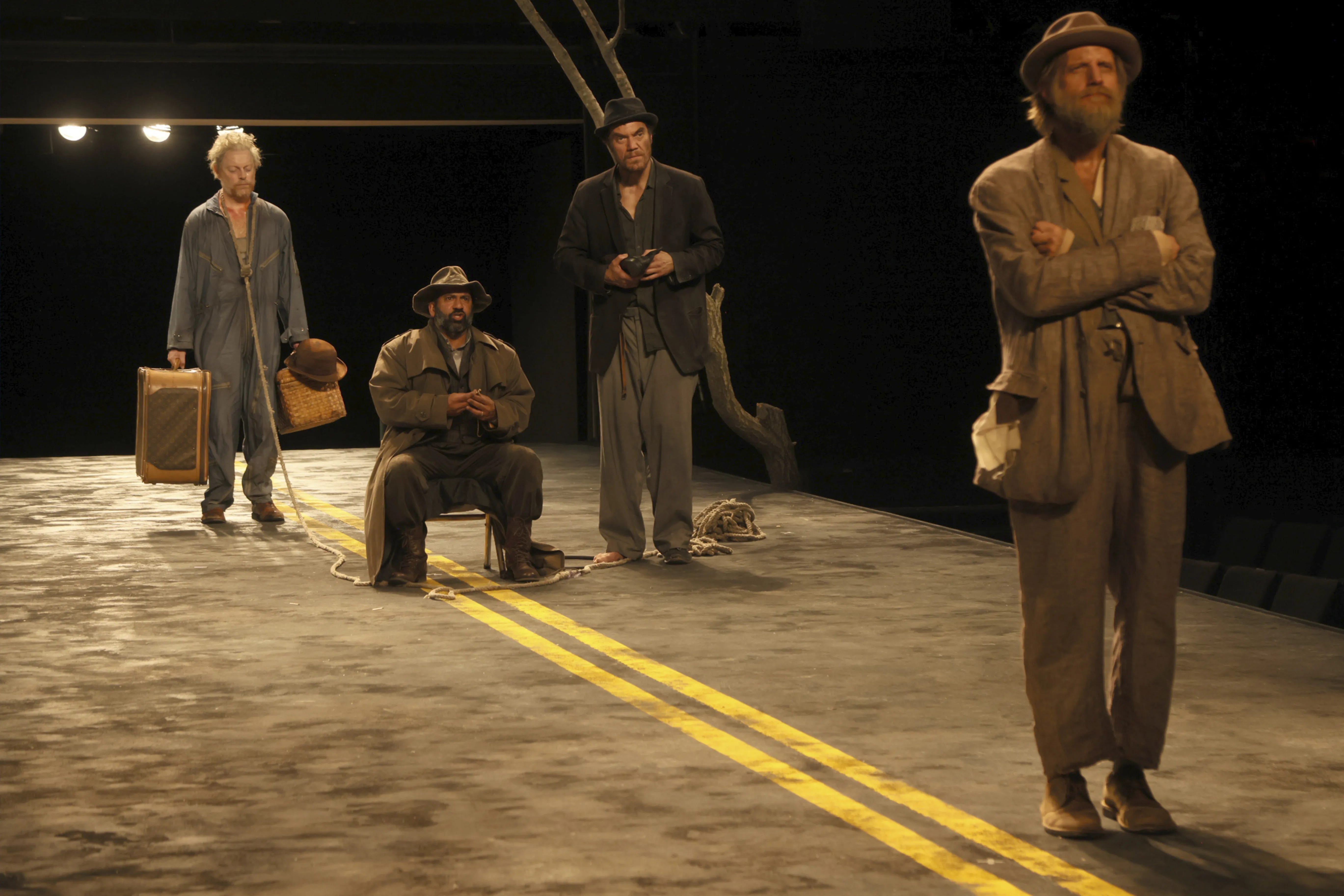
Consider visual clarity within the piece too. Try the exercise of ruthlessly stripping away everything extraneous. Think of the most iconic shots in cinema and how often they are stark, simple, direct. So many successful and franchisable formats have a practically surreal minimalism to them. The absurd lighting, elevated chairs and ladder of avarice in Who Wants To Be A Millionaire. The black room with 20 chicken wings flanked by Sean Evans and a soon-to-suffer celebrity. Endless visually-direct, definite-article game shows: The Wall, The Wheel, The Floor, The Chase, The Cube, The Vault, The Million Pound Drop. There’s an enormous power to this that is often under-tapped for the sake of some inauthentic set dressing or needless graphical complications. It doesn’t have to be in service of the lowest common denominator. I recently went to the Theatre for A New Audience’s production of Waiting For Godot. It was, as always, thrillingly sparse, this time on a stretch of unforgiving road - the focus, then, on the mad, brilliant discourse of these poor forgotten souls.
Conceptual Clarity
“A contagious media project should represent the simplest form of an idea. Fancy design, extra content, or extraneous features make media less contagious. Anything extra constitutes a payload that the contagious media needs to drag along as it spreads. The bigger the payload, the more slowly the entire project spreads.” - Jonah Peretti, Notes On Contagious Media, 2007
High-concept. The elevator pitch. There’s a beauty and efficiency to a neat idea. I’m not advocating dumb or reductive ideation, but the more you unburden your ideas of the immaterial, the faster they move. Transmissibility of a concept can be predicted well by ease of appreciation, assimilation and articulation - I get it, I’m in and I can easily tell someone else about it. Sometimes it’s just about how cute or elegant the solution is to a creative challenge.
Here’s an example - solving the perennial problem that audiences want celebrities to talk about the thing that they’re sick of talking about. Unenviable entertainment correspondents line up and brace themselves to torment actors at promotional junkets with unending remixes of questions about their old projects and strongest-associated topics. How do you, without awkwardness or a sense of grim exploitation, ask Daniel Radcliffe to talk about Harry Potter? Again. How do you ask anyone - in a genuinely-respectful, gently-innovative, non-annoying, totally-optional way - to address the things that they are beyond tired of? My solution was acutely simple: “ask them to google themselves and it will literally autocomplete it.” That solution became the Wired Autocomplete Interview - a series which now has more than 1.5 billion views on YouTube.
With all of these principles, it’s about being militant and being honest with yourself, your team and your partners. Could someone recognise your format, approach or execution just from the thumbnail, poster or opening frames? Can you explain the idea and why anyone would want to see it succinctly in a single, memorable line? Is the way people will first meet your work as punchy, pithy, direct, distilled and uncluttered as it can possibly be?
To be clear - because I know I’ll be misinterpreted as arguing for white cycs and gimmicks, for cheap game show formatting and so-called Mr Beastification - I love complexity, nuance, magic and art. I love abstruse, challenging, confounding, progressive and ambitious work. Work that can struggle to reach the audience it might. That’s one of the reasons that I’m exploring and sharing these ideas here and doing my level best to show that they’re about creative empowerment, not compromise. It isn’t a choice between quality and success, between your artistic goals and the money - it’s about having your cake and then eating it.
Links
Ted Hope is always worth reading, but particularly this blend of belief, realism and unashamedly mixed metaphors on what’s needed for “authored cinema” to survive and thrive.
A friend, Phil Falino, made this lovely, clever piece on the great and recently departed director Terence Davies.
University Challenge, an intensely British and famously quite difficult quiz show, though it bears little resemblance to any other shows that share that designation, is wonderful. Amol Rajan is a brilliant successor to Jeremy Paxman, keeping everything that was good but making it his own. I immediately wanted to skip back to my video remix DJ days and use this moment, when it came up, so it brought me joy to see this article in the Guardian.
Jon Ronson’s podcast about the human reality and sordid origins of the “culture wars”, Things Fell Apart returned for a second season. It’s so compellingly structured that I listened to it in one go - I find his voice calming in a way that only the sound of home can be.
I put a lot into making these end of year playlists. Too much probably. But I love new music more than most things in this god-and-government-forsaken world so here’s my best of 2023:
“He who knows that he is profound strives for clearness; he who would like to appear profound to the multitude strives for obscurity.” - Friedrich Nietzsche, The Gay Science


What’s the best thing about this? Why would someone choose it over something similar? What’s the main value someone’s going to get from it? Why is this worth someone’s time?What will people like most about it? Why will this resonate with people or enrich their lives? Why did you, or anyone, make it? I know all this seems obvious, but you’d be amazed how often people don’t have answers to these.
It emphasizes precise language, stripped-down visuals, and clear messaging to eliminate barriers to entry. Visuals like black screens can symbolize simplicity, focus, and intrigue, embodying the "less is more" concept seen in iconic cinematic shots and minimalist game shows like The Cube or The Chase. Mastering these principles enhances viewer engagement and sets creators apart in a crowded media landscape.https://blackscreen.onl